В нашем Telegram-канале — шедевры живописи, истории уникальных артефактов и эксклюзивные находки. Присоединяйтесь!
Graphics: From the First Lines to Masterpieces!
1.3КJan. 24, 2025Живопись
It is hard to imagine a person who has never been involved in sculpture suddenly starting to create works from clay or stone. Or for someone who has never looked at a painting to decide to paint in oils on canvas without any knowledge of technique. However, graphics is that form of artistic expression familiar to everyone, from children to adults, and it absolutely does not matter whether one has an art education. All it takes is to pick up a pencil and a sheet of paper to create a unique drawing.
Graphics, which translates from Greek as "I write, I draw," is a very diverse genre of fine art, encompassing both drawings and various images created using printing techniques, including engraving. Originally, the word "graphics" was associated exclusively with writing and the art of calligraphy. However, by the beginning of the 20th century, the concept had significantly expanded and came to be perceived as an art based on lines, strokes, spots, and contrasting combinations of black and white. Color can also be used, but the main focus is on form and volume.
One of the characteristic features of graphics is its unique perception of space. Here, the material on which the image is applied plays a key role. In our exploration of the world of graphics, the main focus will be on easel graphics. In the old understanding, an easel was the stand on which artists placed their canvases for painting. Graphic artists do not need an easel, and the name has remained only to designate graphic works regardless of their direction: not a poster, not an illustration, but specifically easel graphics. These works can be part of an exhibition, kept in collections, or decorate the spaces of art connoisseurs.
Graphics can be divided into two main categories: unique and printed (print). Unique graphics encompass techniques such as ordinary drawing, watercolor, gouache, and monotype, creating singular and unrepeatable works. Printed graphics, on the other hand, allows for the production of editions of identical artworks, for example, prints from a plate, block, or linoleum. Each such print is unique and is created using specific processing techniques, which makes it possible to obtain aesthetically valuable impressions.
What is necessary to become a master of graphic art, besides natural talent? If clay is used for creating ceramics, and canvas for painting, then graphics primarily require paper. Various materials, such as pencil, charcoal, and watercolor, allow the artist to leave their marks on paper and create something utterly unique.
Paper
The origin of paper traces back to the distant past. According to legend, it appeared in China over 2200 years ago, and its form at that time consisted of loose wood fiber, making it brittle and fragile. In Europe, the first specimen of paper was created in the 11th-12th centuries based on linen fabrics, and only from the 14th century did it begin to be used for drawing. It was a thick, rough sheet with a yellowish or brown tint. Later, human ingenuity allowed for the addition of sky-blue coloring, which made it possible to more vividly reproduce light effects, such as moonlight. However, it was with the advent of white paper that artists gained the ability to create with pencil, ink, and dyes, and the term "graphics" became associated with these works. At the end of the 19th century, watercolor and gouache also joined the family of graphic techniques. Usually, graphic works are created on small sheets.
Incredibly, despite its apparent simplicity, paper is a vulnerable material. If it is not cared for or if the work has already lost many years, dark spots appear on the surface, like on a very aged person. An example is the famous "Self-Portrait" by Leonardo da Vinci, created in 1512 and now housed in the Royal Library of Turin.
For graphic artists, horizons are open not only with white paper but also with colored paper. It can serve as a background and independently act as an important element of the work, sometimes emphasizing the inner meaning embedded in the image.
As the outstanding French sculptor and graphic artist Dominique Ingres noted, "Drawing is the highest honesty of art." It is a manual image created using graphic means—contour lines, strokes, and spots. Through various combinations of these elements, expressive form, tonal nuances, and chiaroscuro effects are achieved. Drawing is the core of the graphic language and is usually executed in one color, although it can include various shades. This art form is vast in its applications: it can be scientific, applied, or technical. But artistic drawing always holds an important place among all types of visual practices, serving as the foundation for painting, graphics, and reliefs.
As for lines, they appear in a drawing as the trace of a moving point, acquiring expressiveness and serving as the boundary of a form, its contour. These lines establish an organizing structure and make the work complete.
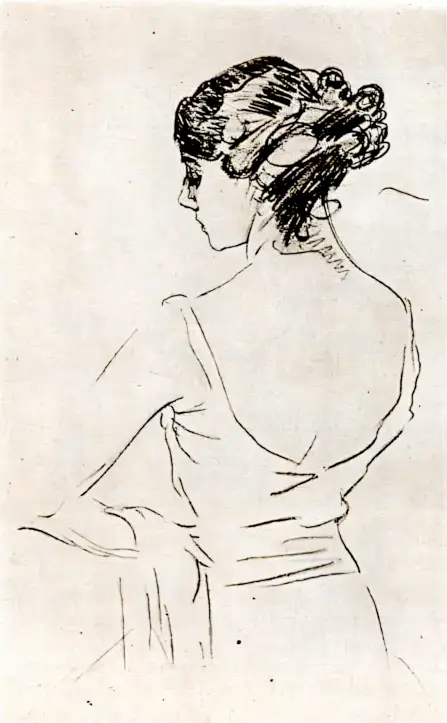
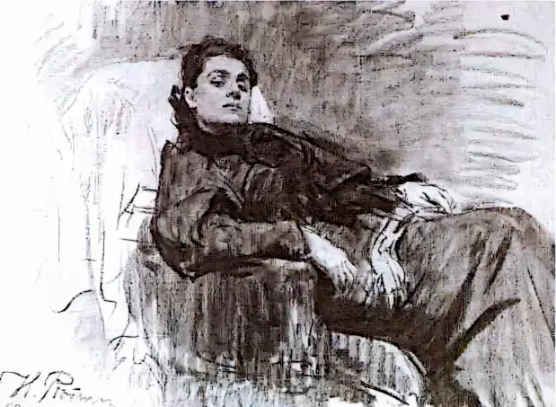
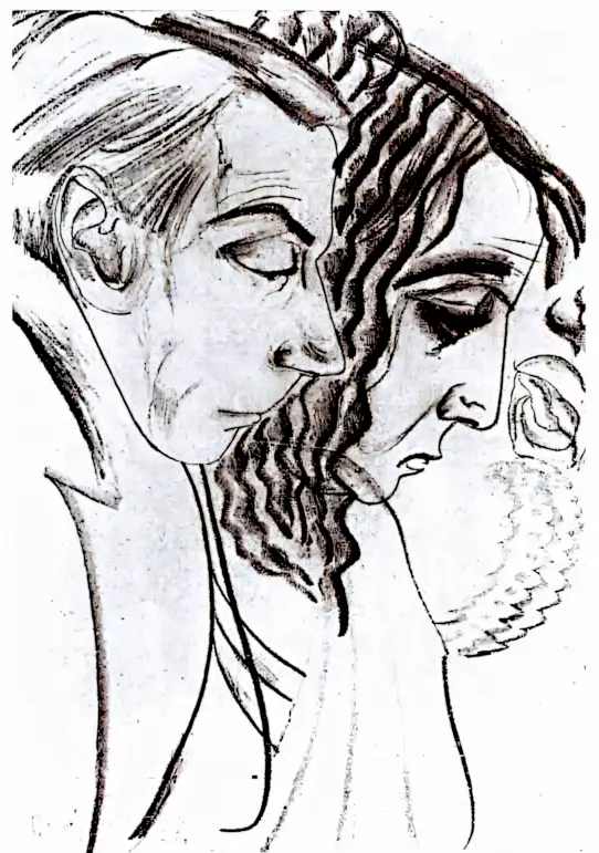
In the vivid and expressive work by Valentin Serov, "Portrait of Tamara Platonovna Karsavina," the main focus is drawn to the lightness and musicality of the line. This line, permeated with sensuality, forms a clear and generalized contour. Its virtuosity and conciseness are impressive: the figure of the famous Russian ballerina, depicted from behind, is effectively anthropomorphic, with a profile view of the face rendered with elegant precision. The hair, drawn vividly and dynamically, conveys thickness and movement with jewel-like accuracy, as if the artist's hand glides smoothly across the paper. The light shading of the neck and face contrasts with the smooth lines of the back and arms, creating a sense of softness and grace.
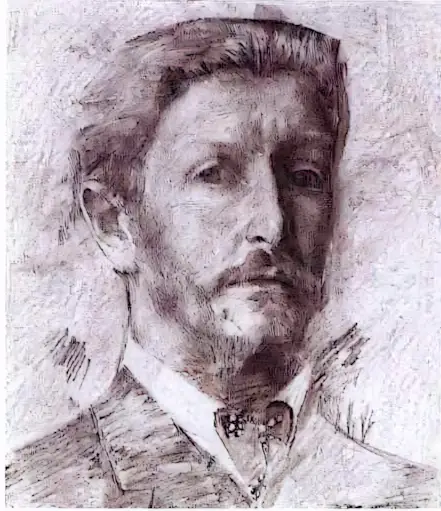
A stroke is not merely a line; it is a manifestation of movement and emotion, becoming the most important means of expression in graphic art. To create expressive effects using strokes, an artist can employ various materials—from pencil to charcoal. Masters sometimes sharpen their tools at an angle to achieve different effects that show texture and depth. Thus, Vrubel in his self-portrait combines charcoal and sanguine, forming a complex interplay of textures: from transparent airiness to a dense and intricate environment reminiscent of exquisite lace. These short lines form images, reflecting their variability and beauty in every stroke.
Ilya Yefimovich Repin became a pioneer among Russian masters in mastering a new technique—charcoal on canvas. "Portrait of Eleonora Duse" might have initially served as a preparatory drawing for a painting, but Repin chose this direction to create an independent graphic work. His skill is reflected in the subtle transitions from black to white, and the velvety combination of tones along with the untouched canvas lend a special expressiveness. Every element here works to create a unique visual effect.
Natural pigments also become original for creativity. For example, sanguine, which is made from volcanic rocks, opens up new possibilities for artists. This clay-like substance, colored by iron oxide, can range from deep red-brown to bright orange shades. Initially, it was used for underpainting frescoes, but from the 14th century, sanguine became an integral attribute of graphic art. In Italy and France, it is used as a primary medium for creating expressive drawings, and among Tuscan artists, there are excellent examples of such works.
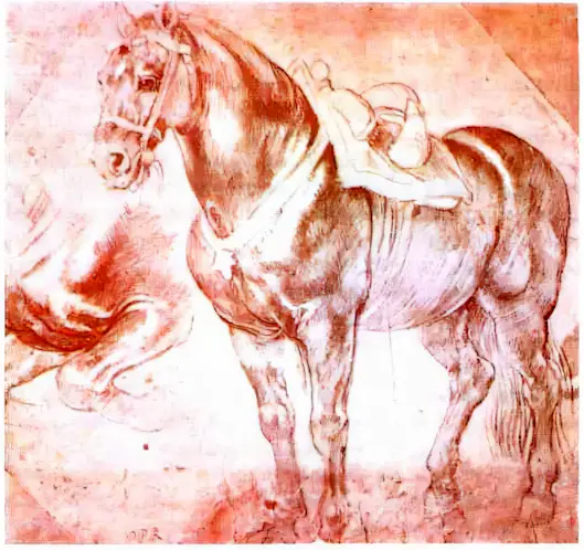
The drawings of Rubens amaze with their versatility: the swiftness of the sketch is combined with masterfully worked-out forms. Here, sanguine serves as a conventional color that models the volume of an elegant animal, and the left white highlights add shine and life, emphasizing the elasticity and grace of the horse.
Pencil
Perhaps there is no more familiar tool for communicating with paper than a pencil. The word "kara" from the Turkic language translates as "black," and "tash" or "dash" as "stone." This tool, which is a stick for writing or drawing, is usually covered with a durable shell. The main component of a pencil is the lead, which is most often placed in a wooden body, but plastic and metal versions can also be found. Depending on the material content, there are graphite, lead, colored, and Italian pencils, as well as shell-less versions such as sanguine and charcoal.
The lead pencil has a long history, having been used since ancient times and remaining in use even among modern artists. This device, inserted into metal, leaves a delicate but clear mark, allowing for the creation of thin and expressive lines.
During the Renaissance, starting from the 14th century, the Italian pencil became popular. Initially, it was made from a black mineral with a grayish tint, known as "black chalk." Later, it began to be produced by mixing powdered burnt bone with vegetable glue. Drawings made with this pencil were distinguished by the saturation of lines and gave deep volume, which made the drawing possess a clearly tangible connection with the surrounding space.
The Italian pencil is ideal for portrait painting. Its softness allows for easy hatching, and the deep color enhances the expressiveness of the image.
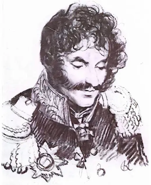
This tool masterfully conveys both the stiffness of the uniform and the softness of the hair in the portrait of General E.I. Chaplitsa, painted by Orest Kiprensky. Long strokes create the dynamics of the uniform, while small lines cleverly model the face with thoughtful eyes. This simplicity of graphic means allows for a deeper exploration of complex emotional states.
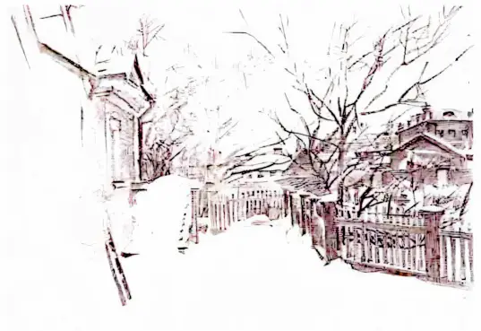
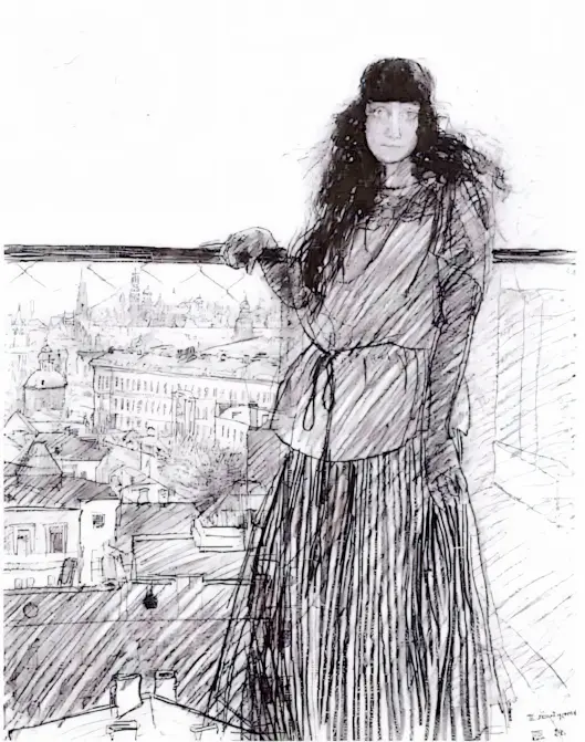
In Moscow, on Myasnitskaya Street, stands a building erected at the end of the 18th century thanks to the talent of the architect Vasily Bazhenov. In the 19th century, the Moscow School of Painting, Sculpture and Architecture was located here, and from 1921 to 1926, training took place at VKHUTEMAS — the Higher Art and Technical Studios. On the roof of this building was a wooden deck, which offered a beautiful view of Moscow. Here, the artist Pyotr Mitrich created a double portrait — of his wife and his native city.
The decisiveness and unprecedented energy of the thin lines, drawn with graphite, become the forms of houses, trees, and the silhouette of a woman. The pencil gradually loses its tension, softly transferring shades onto the roofs, onto the street, and onto the wall of the building, against which Vera Khlebnikova poses. Then the brush comes to life again, pressing on the graphite to create an expressive stroke on her clothing, and then to outline the thickness of her dark hair. In these drawings, the harmony of the unity of man and the nature surrounding him is deeply readable.
Lead, Silver, Italian...
All these tools are mainly used by professional artists, but every "ordinary" person has their own pencil — an ordinary one. The inner filling of this pencil is graphite, crystalline carbon, which is combined with various substances. This natural black substance once had various practical applications, remaining in the shadow of artistic life. At the end of the 16th century, it was used as an auxiliary tool. There was no carbon paper then, and to transfer a drawing from one sheet to another, graphite was used, which was applied to the reverse side. By compressing the random strokes, the artist transferred the image to a new sheet.
Two centuries passed, and in 1790 in France, Nicolas-Jacques Conté, by mixing graphite with clay, achieved an amazing result — he created a material that became the basis for pencils of different hardness. He also began to encase graphite rods in wood, which gave them strength and increased convenience in work.
The renowned contemporary art critic G.G. Pospelov noted about Boris Grigoriev's graphic approach: "... Grigoriev developed a genuine cult of the line, which contrasts with the broad, velvety texture of the flat, rubbed-to-uniformity graphite. Each of his drawings represents a kind of paradox, where apparent carelessness and impressive precision of lines are also mixed; lines that usually seem to casually outline contours, yet cunningly, emptily encompass them, fitting into the surface of the sheet."
Pastel
Working with pencil, ink, or sanguine primarily involves solving tonal tasks. However, color in all its diversity strives to outpace the paper sheet, and it is eagerly welcomed by pastel. It is a colored pencil created from pigment powder and glue, gum arabic, sometimes with the addition of honey and milk. Typically, pastel looks like a small cylindrical stick. Leonardo da Vinci pointed out that pastel is dry painting. It was discovered in France at the end of the 15th century. The art of pastel is based on how strong, pure, and soft the colors can be, which retain their pristine freshness.

Pastel can be fast and dynamic, depicting movement, but more often, different properties are expected from it: slowness and the ability to work with large strokes, creating extensive masses.
Ilya Repin was a true master of graphics, and this is confirmed by his student, the later celebrated artist Isaac Brodsky: "Repin's palette shone with diversity and saturation, and his pencil not only obeyed but possessed enormous potential, allowing him to overcome all difficulties encountered along the way. However, behind this apparent ease lay years of work on himself, constant training, refinements, and the serious school that Repin went through."
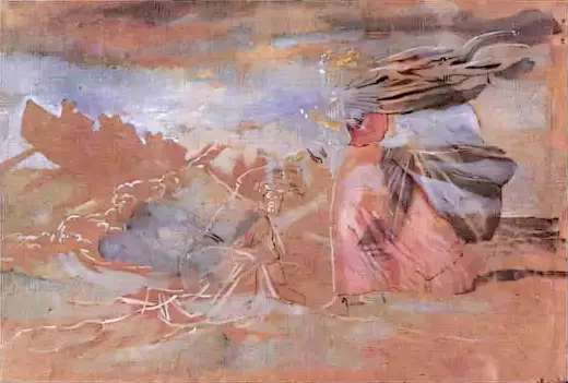
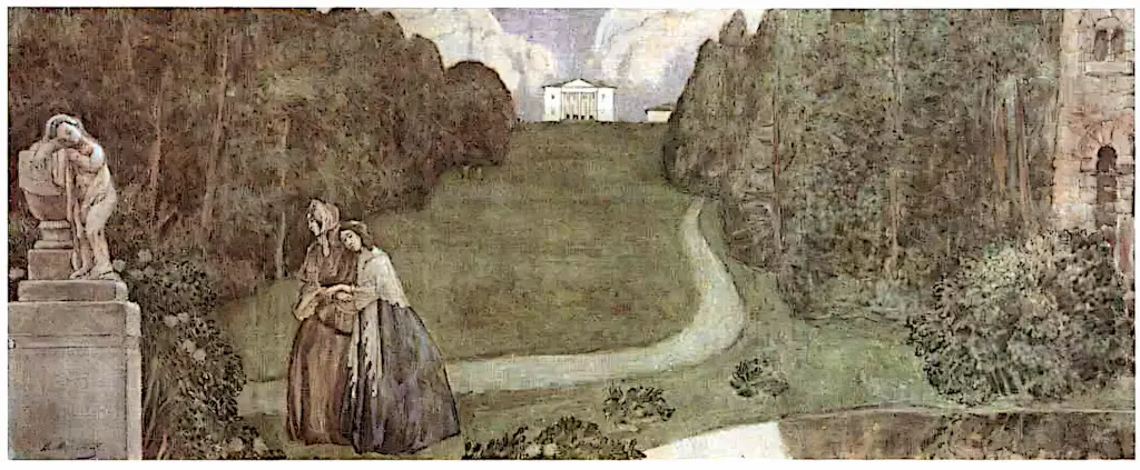
In the magnificent pastel "Hazel Bush" by Viktor Borisov-Musatov, a remarkable interplay of space and air is traced. The artist achieves harmony through elegant rhythm, alternating light and bright tones.
Ink, Bistre, Sepia, and Sauce.
Ancient China became the birthplace for the creation of Chinese ink, made from soot, gelatin, and camphor. For centuries, it was used for work with pen and stump. In Europe, slightly later, ink began to be produced from gall nuts, despite some negative aspects, such as a tendency to yellow over time, which could deteriorate the quality of the paper. Colored variants of ink also exist; one of them, dark brown, bears the name bistre.
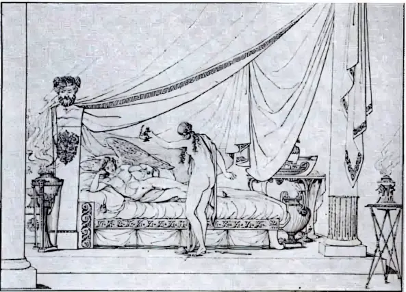
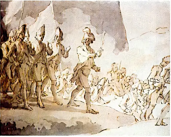
In the series of illustrations by Fyodor Tolstoy for Bogdanovich's poem, the emphasis is on line, which is sufficient to create a precise, expressive break. The master was clearly inspired by Greek vase painting and ancient ornamentation, which became a significant starting point for him in creating decorative contour images.
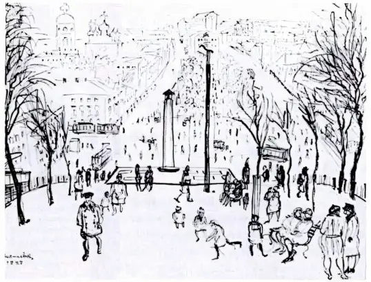
The light, playful, sometimes even ironic works of Vladimir Milashevsky, capturing an entire era, become a special reflection of a time that no longer exists. The artist's friend and a good graphic artist himself, Nikolai Kuzmin, highly appreciated his working method: "It's not about the tool, but about the approach. When you draw with charcoal, for example, there is always the possibility to correct a mistake by simply wiping it away with a cloth. Like a pencil—there is hope in an eraser. But when you work with ink or a match, it requires complete concentration and a high level of intentionality; here, the moments when you act without hesitation are important, like a small child or like Rembrandt. Long live the match!"
In the nineteenth century, metal nibs appeared on the horizon of graphic art, allowing for thin and clear lines. Today, ink can be worked with not only using nibs but also brushes. Moreover, ink comes in different colors—black or brown. People also learned to use a special liquid that a cuttlefish releases in moments of danger. Diluted with fresh water, it offers shades from dark brown to light fawn—this very liquid is called "sepia." Since the 19th century, sepia began to be produced through chemical processes.
Linear strokes, created from finely ground materials combined with vegetable glue, lead to the emergence of sauce—a unique graphic material. Its history spans over two centuries, and it became known in the late 18th — early 19th century. Sauce, possessing tonal depth and a pleasant velvety quality, stands out due to its wide range of tonal possibilities, making it very attractive to artists.
Sauce can be applied both dry and wet. When using the dry method, a stick of sauce is rubbed against the rough surface of the paper, and the resulting dust is applied to a preliminary pencil sketch using a stump—a tightly rolled material. In most cases, artists prefer to work with wet sauce, diluting it with water. This technique allows combining sauce with other materials, creating unique effects.
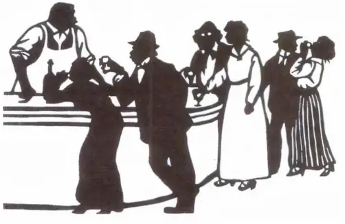
There is an interesting story about how in 1757, the French financier Étienne de Silhouette, while serving as Comptroller-General of Finances, demonstrated his artistic inclinations. Saving on the interior of his castle, he began decorating the walls with silhouettes of guests, tracing their outlines and then filling them in with black paint. This is how the "silhouette" style emerged, which became a symbol of refined minimalism.
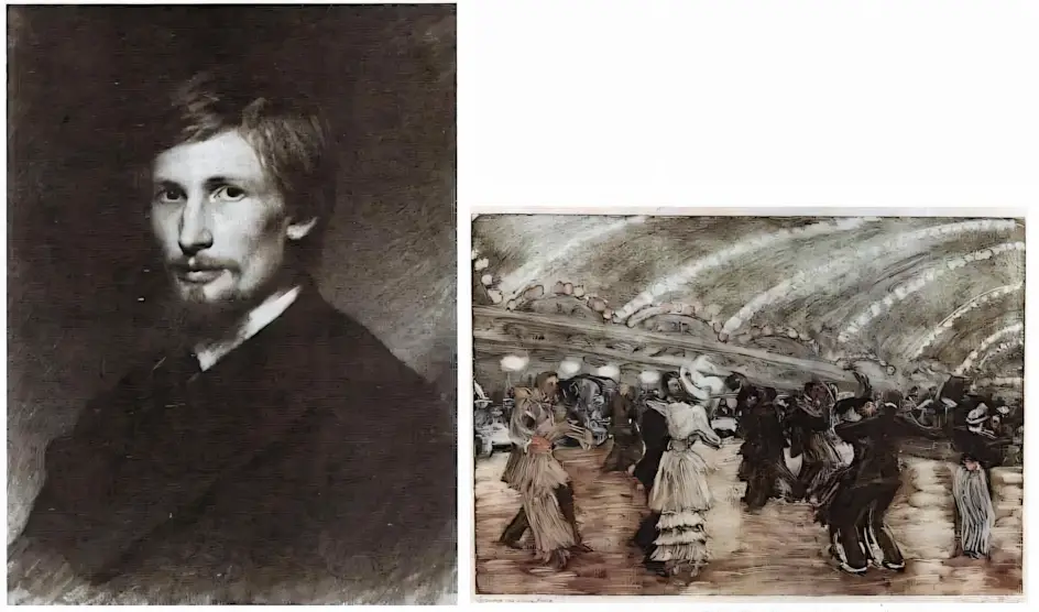
In the graphic works of Elizaveta Kruglikova, one can notice sharpness and irony in depicting scenes, such as the one where Alexei Tolstoy observes a lady in white against the backdrop of a café. The works reflect not only the appearance of the characters but also their inner state, with each stroke conveying the atmosphere of the time and place. This remarkable intertwining of graphics and textual irony creates an indescribable connection between art and literature.

Speaking of color, one cannot fail to mention watercolor, which takes on a unique existence thanks to the interaction of water with pigments. This technique involves the use of ground coloring powder combined with binding agents, to which sweet additives like honey or sugar are sometimes added to soften the color. Watercolor comes in various textures: hard cakes, semi-soft in ceramic containers, and soft tube forms.
Watercolor
Many artists argue that the presence of color in watercolor makes the work a painting. However, the graphic foundation becomes evident in cases where color is carefully applied to paper, creating transparent, light layers. This emphasizes the vitality and freshness of watercolor art.
Viktor Borisov-Musatov, as a devoted admirer of art with a dream of creating decorative panels, fits into the style of his time—"Art Nouveau." In this movement, all elements should harmoniously intertwine, subordinating to the philosophy of art and life. Although his plans for panels were not realized, the legacy of his work continues to influence new generations of artists, inspiring them to seek original graphic solutions.
Indeed, watercolor sketches can immerse one in a world of magic, comparing painting to musical melodies. The artist grapples with the question of how lines and color masses relate to each other, how rhythms lead to the melodic motifs of the work. A sense of sadness and melancholy fills the composition "Dream of a Deity," where the delicate, airy touch of watercolor, framed by the white pauses of the paper, perfectly conveys a deep semantic load.
It is interesting to note that black watercolor, obtained from lamp soot, can be considered a real find for an artist. It possesses a rich palette of tonal transitions, creating a transparent and vibrating sensation on the surface of the sheet. Upon close examination, one can see how the rhythm and harmony of smooth lines, transitioning into soft shadow spots, echo the measured melody of poetic speech.
Watercolor can be used economically by lightly shaking water off the brush, which allows for painting "dry." An alternative approach involves recreating bright colors on moistened paper, giving the painting dynamism and breadth.
Similar to watercolor, gouache, translated as "water paint," emerged as a successor to its predecessor. Specifically to increase the density of the paint layer, white pigment began to be added to this paint. Gouache consists of finely ground pigments and a water-based glue binder, with the addition of wheat starch. This art form has been used since ancient times in Europe and Asia to create miniatures, and during the Renaissance, it became a common element for sketches and portraits. The most notable achievements in gouache technique occurred at the end of the 19th — beginning of the 20th century, although its examples can be found in earlier works as well.
Monotype, in turn, represents a unique work created in a single copy. The process of obtaining this work involves applying paint to a smooth metal surface, and then an imprint obtained under pressure on special presses. Monotype is distinguished by the expressiveness of color combinations, often approaching watercolor technique. It can also be combined with other graphic methods, such as etching.
The craftswoman Elizaveta Kruglikova, always striving for novelty, used the matte surfaces of oil paints and experimented with colors and paper textures. Her agitation due to the outbreak of the First World War subtly reflected in the nervous rhythm of the dance, where the verticals of figures with "running" garlands create a sense of anxiety. Delicate blue and pearlescent shades give the work an unreal atmosphere.